Equiflow: Bridging the Gap in California Water Equity Data
![[background image] image of contact office (for a general contractor)](https://cdn.prod.website-files.com/689687db816830fc9288fc79/69546ea26712f4c48dce1d27_Home%20Screen.jpg)
![[background image] image of contact office (for a general contractor)](https://cdn.prod.website-files.com/689687db816830fc9288fc79/69546fa8f9b069a9b0430d94_Chat%20interface.jpg)
The Analysis Breakdown
The Problem
California’s water management systems are governed by massive, opaque datasets that are largely inaccessible to the people most affected by climate change—small-scale farmers, tribal communities, and marginalized residents.
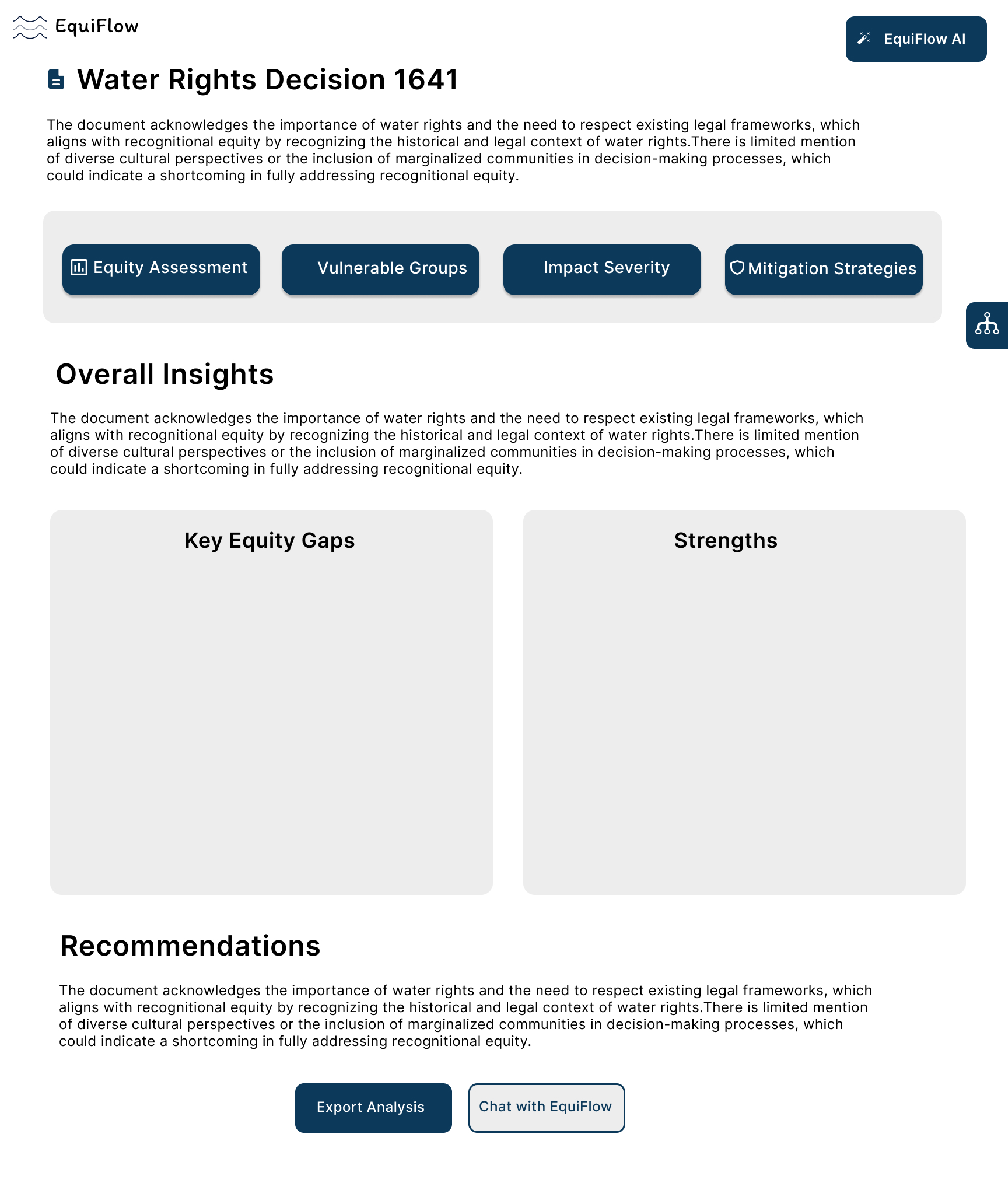
The Pain Point: Scientific models are often built by engineers for engineers. This "technical gatekeeping" meant that community advocates couldn't interpret the data necessary to fight for their fair share of resources, leading to biased resource allocation.
The Constraints: I had to navigate a high-stakes environment involving a $9.1M budget, multiple academic institutions, and the technical limitation of translating "messy," unstructured climate data into a real-time visual interface.
The Team
Worked as a solo designer in a team of two developers and under supervision of a Grad Student
The Solution
I designed Equiflow, a platform that prioritizes "Data Literacy" as much as data delivery.
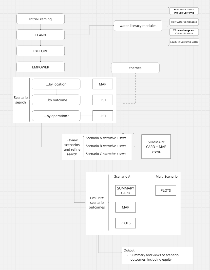
The Framework Explorer: A modular dashboard that allows users to toggle between different climate scenarios and see the direct impact on their specific region.
I didn't just design the UI; I worked directly with developers to refactor the JSON schema. By aligning the developer’s backend logic with the designer’s frontend vision, I ensured that the technical architecture supported the human-centered goals of the project. This eliminated the "translation error" between the code and the community.
The Approach
To build a tool that truly served the community, I had to find the human story buried in the spreadsheets.
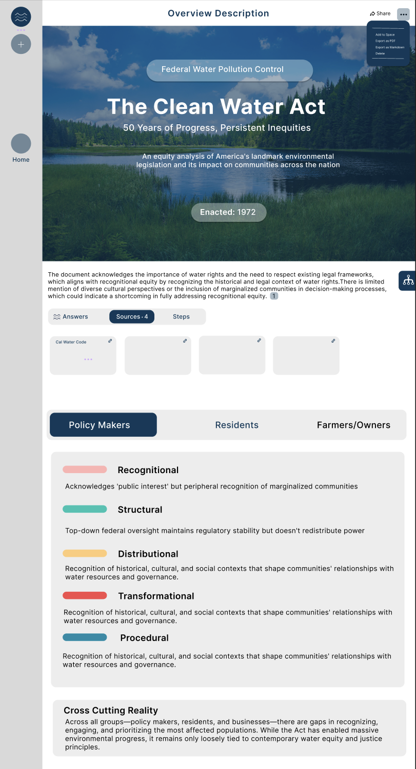
Researching the "Truth": I conducted deep-dive interviews and auditing sessions with diverse stakeholders, from state policymakers to local activists. I realized the problem wasn't a lack of data, but a lack of structure
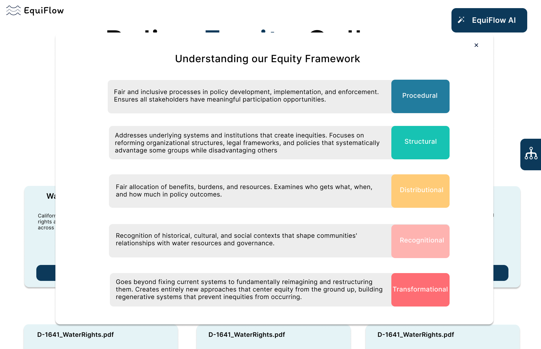
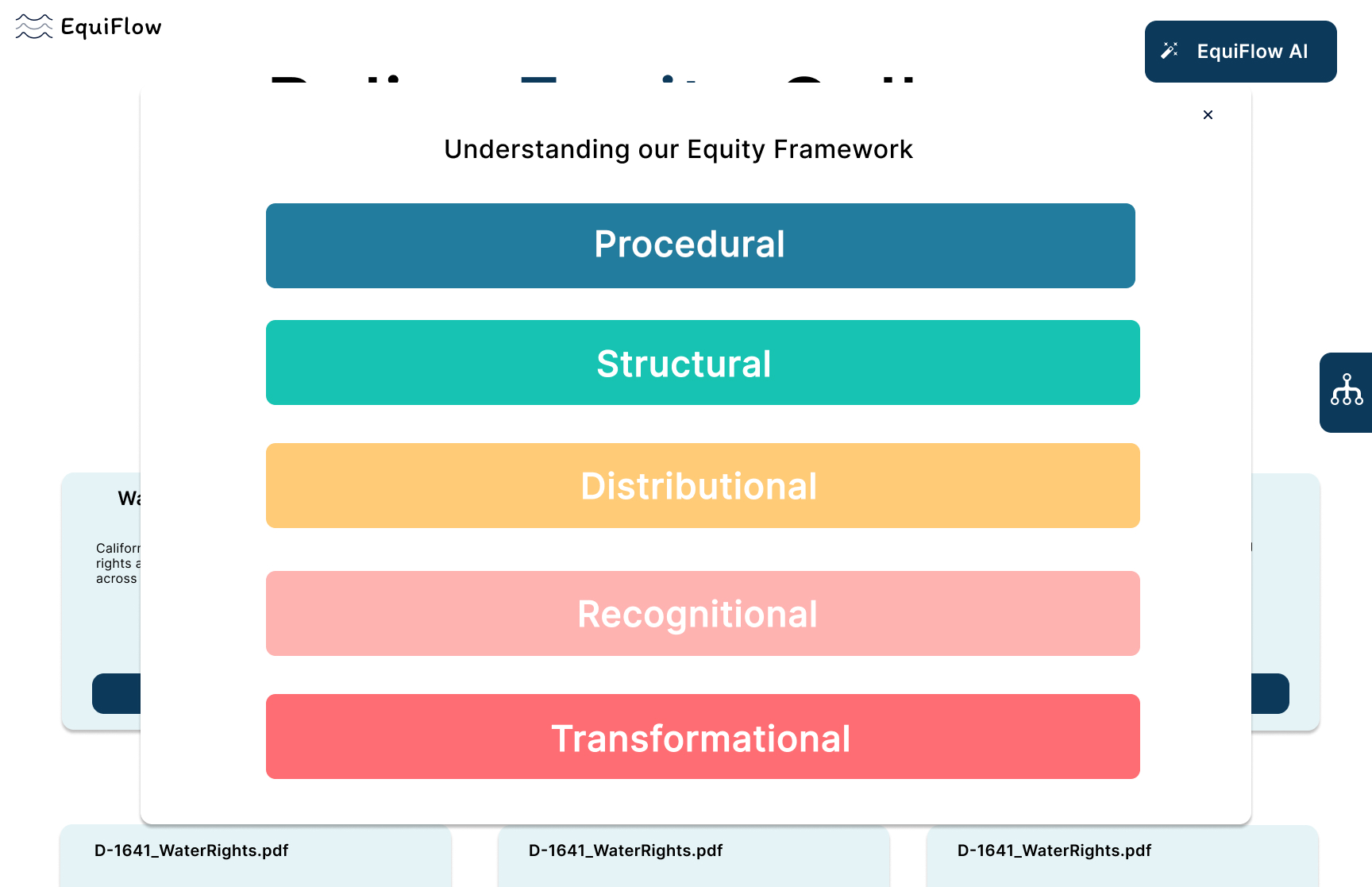
Information Architecture: I took the "messy" scientific variables—precipitation rates, reservoir levels, and socioeconomic indicators—and organized them into a hierarchical "Framework Explorer." This allowed users to filter data based on their specific community needs rather than wading through raw scientific noise.
![[interface] screenshot of app on a tablet (for a consumer apps)](https://cdn.prod.website-files.com/689687db816830fc9288fc79/6955fc7aacd28120e0b8e8fe_Screenshot%202025-12-31%20at%208.44.46%E2%80%AFPM.png)
.jpg)
![[digital project] image of a graphic design on a screen (for a web design agency)](https://cdn.prod.website-files.com/689687db816830fc9288fc79/6955fc76d8593e9b7fc7c76d_Screenshot%202025-12-31%20at%208.46.07%E2%80%AFPM.png)